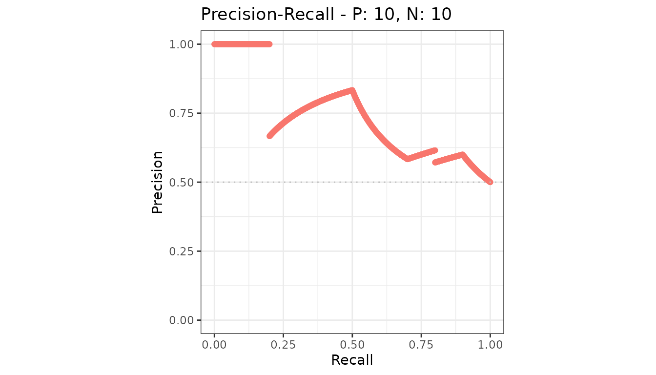
The default plot of an evalmod() object: the ROC curve
and the precision-recall curve, side by side.
library(precrec)
library(ggplot2)

curves <- evalmod(scores = P10N10$scores, labels = P10N10$labels)

autoplot(curves)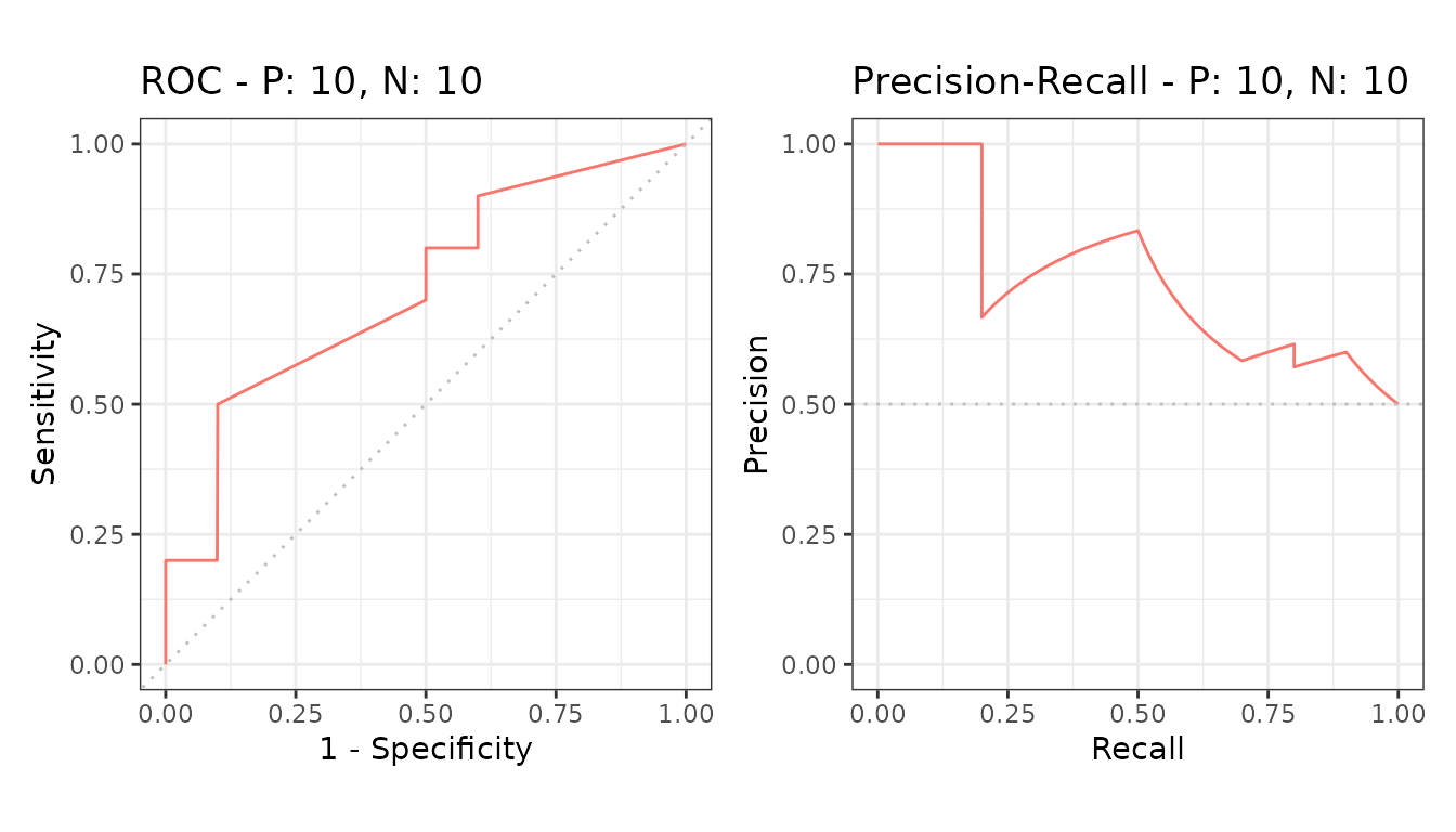
Reading them
The ROC curve plots sensitivity against the false positive rate. Both axes are rates over the actual classes, so the curve does not move when the class balance changes. The diagonal is random performance.
The precision-recall curve plots precision against recall. Precision depends on how many negatives there are, so this curve does move with the class balance - which is exactly what makes it the informative one on imbalanced data.
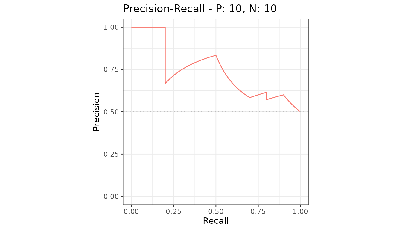
Several models
Each model gets its own line and a legend entry.
samps <- create_sim_samples(1, 100, 100, "all")
mdat <- mmdata(samps[["scores"]], samps[["labels"]],
  modnames = samps[["modnames"]]
)

autoplot(evalmod(mdat), "PRC")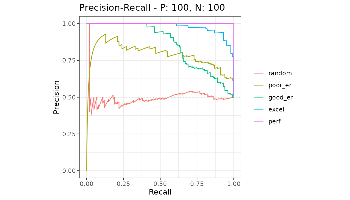
Several test sets
With more than one test set per model, the line is the average and the shaded region is its confidence band. See confidence bands.
samps2 <- create_sim_samples(10, 100, 100, "good_er")
mdat2 <- mmdata(samps2[["scores"]], samps2[["labels"]],
  dsids = samps2[["dsids"]]
)

autoplot(evalmod(mdat2), "PRC")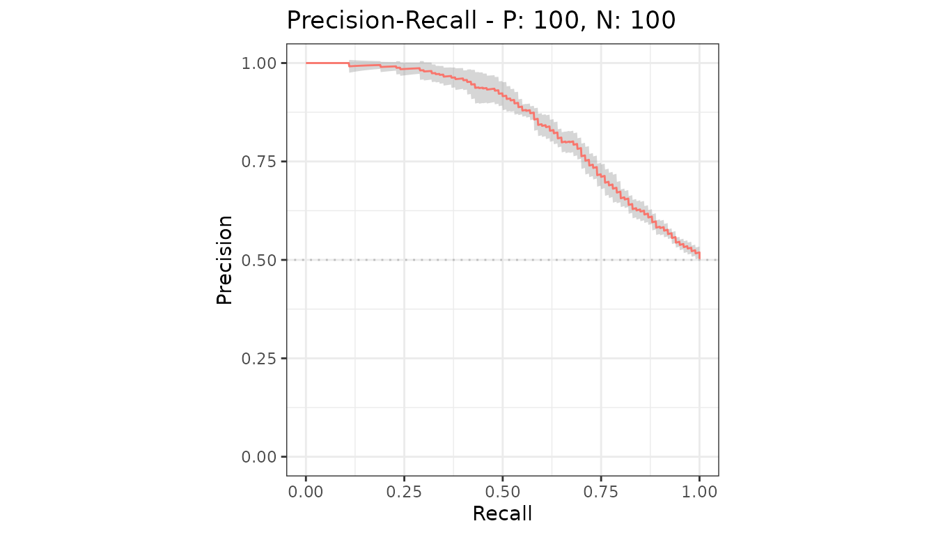
Why no baseline is drawn
A precision-recall curve is read against a baseline that sits at the
proportion of positives, and that proportion differs from dataset to
dataset. Drawing one line for several datasets - or several one-vs-rest
classes - would be wrong more often than right, so the plots leave it
out. Add your own with geom_hline(); see customizing plots.