
Balanced and imbalanced data
Source:vignettes/articles/howto-imbalanced-data.Rmd
howto-imbalanced-data.RmdThis is the reason the package exists. When positives are rare, a ROC curve can look excellent for a classifier that is not usable, while the precision-recall curve shows the problem plainly.
Two datasets, same models
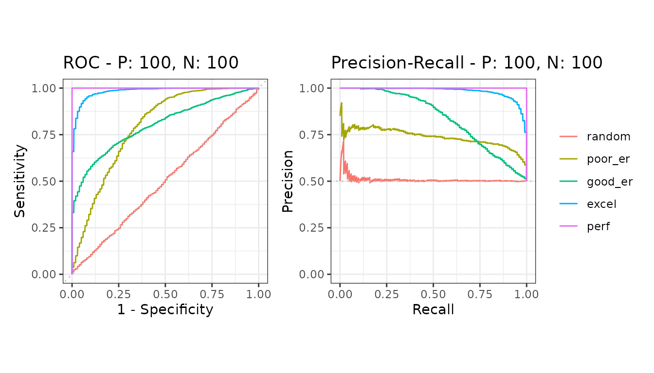
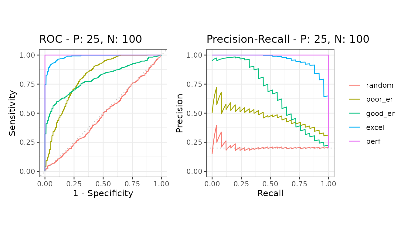
The only difference between them is the class balance: 100 positives against 100 negatives, and 25 positives against 100 negatives.
balanced <- create_sim_samples(20, 100, 100, "all")
imbalanced <- create_sim_samples(20, 25, 100, "all")

bdat <- mmdata(balanced[["scores"]], balanced[["labels"]],
  modnames = balanced[["modnames"]], dsids = balanced[["dsids"]]
)
idat <- mmdata(imbalanced[["scores"]], imbalanced[["labels"]],
  modnames = imbalanced[["modnames"]], dsids = imbalanced[["dsids"]]
)
What changed
The ROC curves are almost identical between the two. The precision-recall curves are not: every model drops, because precision depends on how many negatives there are to be mistaken for positives, and the ROC axes do not.
A ROC curve is therefore the wrong plot for reporting how a classifier will behave on data where positives are rare - which is most screening, detection and diagnostic problems.
The baseline moves too
A precision-recall curve is read against its baseline, which sits at the proportion of positives: 0.5 above, 0.2 in the imbalanced case. The same curve means something different against a different baseline, which is why the two plots above cannot be compared by eye alone.
The same is true of the area, and there the baseline is easier to
forget because the plot is not in front of you. auc()
reports it in the baselines column:
areas <- rbind(auc(evalmod(bdat)), auc(evalmod(idat)))

knitr::kable(
  subset(areas, curvetypes == "PRC" & modnames == "good_er" & dsids == 1),
  row.names = FALSE, digits = 3
)| modnames | dsids | curvetypes | aucs | baselines |
|---|---|---|---|---|
| good_er | 1 | PRC | 0.857 | 0.5 |
| good_er | 1 | PRC | 0.684 | 0.2 |
The same model on the two datasets above. The area falls, and so does the baseline it is read against - from 0.5 to 0.2. How much of the fall is the classifier doing worse and how much is the class balance moving underneath it is not a question the area answers on its own, which is why the two numbers belong together.
Why not fold the baseline in?
If the area has to be read against its baseline, the obvious thought
is to build the baseline into the area and be done with it. On the ROC
side there is such a thing - the McClish correction,
pauc(corrected = TRUE), which rescales a partial area
between chance and perfect.
For the precision-recall curve the published proposal is
Precision-Recall-Gain (Flach & Kull 2015). It rescales both axes
against the baseline pi,
precG = 1 - (pi / (1 - pi)) * ((1 - prec) / prec)
recG  = 1 - (pi / (1 - pi)) * ((1 - rec)  / rec)
so that chance sits at 0 and perfect at 1
whatever the class balance, and the area under the resulting curve
(AUPRG) is one number with the baseline already in it. The argument
behind it is a serious one, and it depends on the curve being
interpolated correctly, which is this package’s whole business.
It does not do what someone reaching for it wants. Here the same 200 positives appear in every row and negatives are added underneath them, so the classifier and the positive sample never change - only the prevalence does.
gain <- function(v, pi) 1 - (pi / (1 - pi)) * ((1 - v) / v)

auprg <- function(scores, labels) {
  pi <- mean(labels == 1)
  d <- as.data.frame(evalmod(scores = scores, labels = labels))
  prc <- d[d$type == "PRC", ]
  rg <- gain(prc$x, pi)
  pg <- gain(prc$y, pi)
  ok <- is.finite(rg) & is.finite(pg)
  # Integrate precG over recG from 0 to 1
  grid <- sort(unique(c(0, 1, rg[ok][rg[ok] > 0 & rg[ok] < 1])))
  v <- approx(rg[ok], pg[ok], xout = grid, rule = 2, ties = "ordered")$y
  sum(diff(grid) * (head(v, -1) + tail(v, -1)) / 2)
}

set.seed(11)
pos <- rnorm(200, 1.2)
negpool <- rnorm(9800, 0)

row_at <- function(nn) {
  scores <- c(pos, negpool[seq_len(nn)])
  labels <- rep(c(1, 0), c(200, nn))
  areas <- auc(evalmod(scores = scores, labels = labels))

  data.frame(
    positives = sprintf("%.0f%%", 100 * 200 / (200 + nn)),
    roc = areas$aucs[areas$curvetypes == "ROC"],
    prc = areas$aucs[areas$curvetypes == "PRC"],
    prc_baseline = areas$baselines[areas$curvetypes == "PRC"],
    auprg = auprg(scores, labels)
  )
}

knitr::kable(
  do.call(rbind, lapply(c(200, 1800, 9800), row_at)),
  row.names = FALSE, digits = 3
)| positives | roc | prc | prc_baseline | auprg |
|---|---|---|---|---|
| 50% | 0.815 | 0.810 | 0.50 | 0.639 |
| 10% | 0.807 | 0.351 | 0.10 | 0.850 |
| 2% | 0.805 | 0.113 | 0.02 | 0.941 |
On the AUPRG scale a coin flip scores 0 and a perfect
ranking 1, so 0.639 and 0.941 are
far apart on it. The ROC area holds within 0.01, as it should. The
precision-recall area falls, which is the whole point of the page. And
AUPRG rises - three tenths of its range, in the
opposite direction, on a classifier that did not change.
That is the thing to notice. Folding the baseline in did not remove
the dependence on prevalence; it reversed it. A number that says a
classifier got better because its positives got rarer is not more
comparable across datasets than the one it replaced - it is incomparable
in a direction that happens to flatter the hard case. The
baselines column is less clever and harder to misread.
So precrec reports the area and the baseline as two
numbers and leaves them that way, and there is no auprg()
here. The few lines above are all it takes if you want it for a curve
you have already computed, and Flach & Kull’s own argument for it -
that the precision-recall area is a poorly founded summary quite apart
from any question of class balance - is worth reading on its own
terms.
The baseline is an asymptote
The prevalence is what the area is worth by chance in the limit. An area measured on a finite sample scatters around its chance level rather than sitting on it, and how widely depends on the number of positives - which is what imbalance takes away.
Here is a classifier with no signal whatever, scored four hundred
times on fresh random labels. Twenty positives in a thousand, the same
2% as above. The column is the area divided by the baseline
auc() reports for it, so chance is 1.
np <- 20
nn <- 980
prevalence <- np / (np + nn)

noise <- t(sapply(seq_len(400), function(i) {
  set.seed(i)
  curves <- evalmod(
    scores = rnorm(np + nn), labels = rep(c(1, 0), c(np, nn))
  )
  areas <- auc(curves)
  top <- pauc(part(curves, xlim = c(0, 0.1)))

  c(
    whole = areas$aucs[areas$curvetypes == "PRC"],
    top = top$spaucs[top$curvetypes == "PRC"]
  ) / prevalence
}))

knitr::kable(
  data.frame(
    region = c("the whole curve", "the first tenth of recall"),
    mean = colMeans(noise),
    median = apply(noise, 2, median),
    over_2x = colMeans(noise > 2)
  ),
  row.names = FALSE, digits = 2
)| region | mean | median | over_2x |
|---|---|---|---|
| the whole curve | 1.15 | 1.02 | 0.04 |
| the first tenth of recall | 1.86 | 0.89 | 0.18 |
A classifier that knows nothing averages 1.15 times its baseline over the whole curve, and 1.86 times over the top of the ranking - where it clears twice the baseline about one run in five. The median tells you what kind of error this is: at 0.89 it sits below chance, so the distribution is skewed rather than shifted. Most draws land near or under the baseline and a few land far above it, and any one dataset is one draw.
Two hundred positives brings the first figure to 1.01 and two
thousand removes it entirely, so what drives this is the number of
positives rather than the balance. average_precision()
shows the same thing, so it is not an artifact of the interpolation
either. Rare positives cost you twice over: few positives to estimate
from, and a small baseline with room above it for the tail to run
into.
None of this makes the baseline the wrong number - it is the right one, and the fall from 0.5 to 0.2 above is real. What it means is that dividing an area by its baseline is not a test.
So put an interval on it
auc_boot() resamples a single test set, and
auc_ci() reads an interval off the resamples. Both now
report the baseline beside the area, so the comparison is one table
rather than two.
set.seed(57)
pure_noise <- auc_boot(
  scores = rnorm(np + nn), labels = rep(c(1, 0), c(np, nn)),
  boot_n = 500, seed = 1
)

knitr::kable(
  auc_ci(pure_noise)[, c(
    "curvetypes", "aucs", "baselines", "lower_bound", "upper_bound"
  )],
  row.names = FALSE, digits = 3
)| curvetypes | aucs | baselines | lower_bound | upper_bound |
|---|---|---|---|---|
| ROC | 0.496 | 0.50 | 0.329 | 0.667 |
| PRC | 0.036 | 0.02 | 0.016 | 0.087 |
The ROC area lands on 0.5, as it should for a classifier built out of
rnorm(). The precision-recall area is 1.8 times its
baseline, which read on its own is the sort of number people write down.
The interval contains the baseline, which is the correct answer.
The interval is well behaved on this case even at twenty positives: over a hundred and twenty runs of the simulation above, the 95% bootstrap interval covered the baseline 94% of the time and its lower bound cleared the baseline 2.5% of the time, which is what a 95% interval is supposed to do. The resampling is stratified, so every resample holds the same class balance as the test set and the baseline does not move underneath the quantity being estimated.
With several test sets, auc_ci() does the same job from
the variation between them, and averages the baseline over the same
datasets it averaged the area over - a fold need not hold the classes in
the proportions the whole dataset does.
pauc() carries the same two numbers for a restricted
region, where they are easier still to get wrong: a standardized partial
ROC area over false positive rates up to 0.2 has a chance level of 0.1,
not 0.5.
So does the threshold
Everything above is about reading a curve. The last step of most real work is picking a point on it, and the criterion that picks it is subject to the same problem.
Twenty-five positives in five hundred, and four of the criteria best_cutoff() offers, on the same model:
set.seed(42)
rare <- create_sim_samples(1, 25, 475, "good_er")
rdat <- mmdata(rare[["scores"]], rare[["labels"]])

shown <- c(
  "metric", "rank", "score", "sensitivity", "precision", "fscore", "mcc"
)
picks <- lapply(
  c("youden", "topleft", "fscore", "mcc"),
  function(criterion) best_cutoff(rdat, metric = criterion)[, shown]
)

knitr::kable(do.call(rbind, picks), row.names = FALSE, digits = 3)| metric | rank | score | sensitivity | precision | fscore | mcc |
|---|---|---|---|---|---|---|
| informedness | 78 | 0.386 | 0.72 | 0.231 | 0.350 | 0.357 |
| roc_dist | 103 | 0.349 | 0.76 | 0.184 | 0.297 | 0.314 |
| fscore | 22 | 0.612 | 0.44 | 0.500 | 0.468 | 0.443 |
| mcc | 22 | 0.612 | 0.44 | 0.500 | 0.468 | 0.443 |
Four criteria, three different thresholds, and the disagreement is
not a rounding detail: Youden’s J calls 78 of the 500 instances positive
and mcc calls 22. The model is the same one and the data is
the same data.
Youden’s J and the closest point to the top left corner are both
computed from sensitivity and specificity, and both of those are
conditioned on the true class, so neither knows that positives are rare.
They are free to buy sensitivity with false positives that cost them
nothing, and they do - precision at the cutoff Youden’s J picks is half
of what it is at the one mcc picks. fscore and
mcc are computed from precision as well, so the prevalence
is in the number they are maximizing.
That does not make mcc the right answer either. It buys
its precision with sensitivity, and whether that trade is the one you
want is a question about the application, not about the data. What the
table settles is narrower and more useful: the criterion is a
choice, and on imbalanced data the prevalence-blind ones and
the prevalence-aware ones do not land anywhere near each other.
One caveat that applies whatever the balance: a threshold chosen on the same data the model was evaluated on is optimistic, by however much the criterion was free to chase. If the number is going to be quoted, choose it on data the model has not seen.
Further reading
- The Precision-Recall Plot Is More Informative than the ROC Plot When Evaluating Binary Classifiers on Imbalanced Datasets - the paper behind this package
-
Precision-Recall-Gain
Curves: PR Analysis Done Right
- Flach & Kull’s case against the precision-recall area, and the alternative measured above
- Classifier evaluation with imbalanced datasets - a companion site with practical tips