
When a model has more than one test set, precrec
averages the curves and draws a point-wise confidence band around the
average. No extra call is needed.
library(precrec)
library(ggplot2)

samps <- create_sim_samples(10, 100, 100, "good_er")
mdat <- mmdata(samps[["scores"]], samps[["labels"]], dsids = samps[["dsids"]])
How the average is built
Curves from different test sets have their supporting points in
different places, so they cannot be averaged directly.
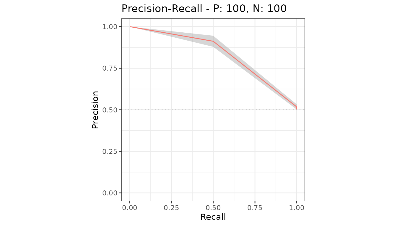
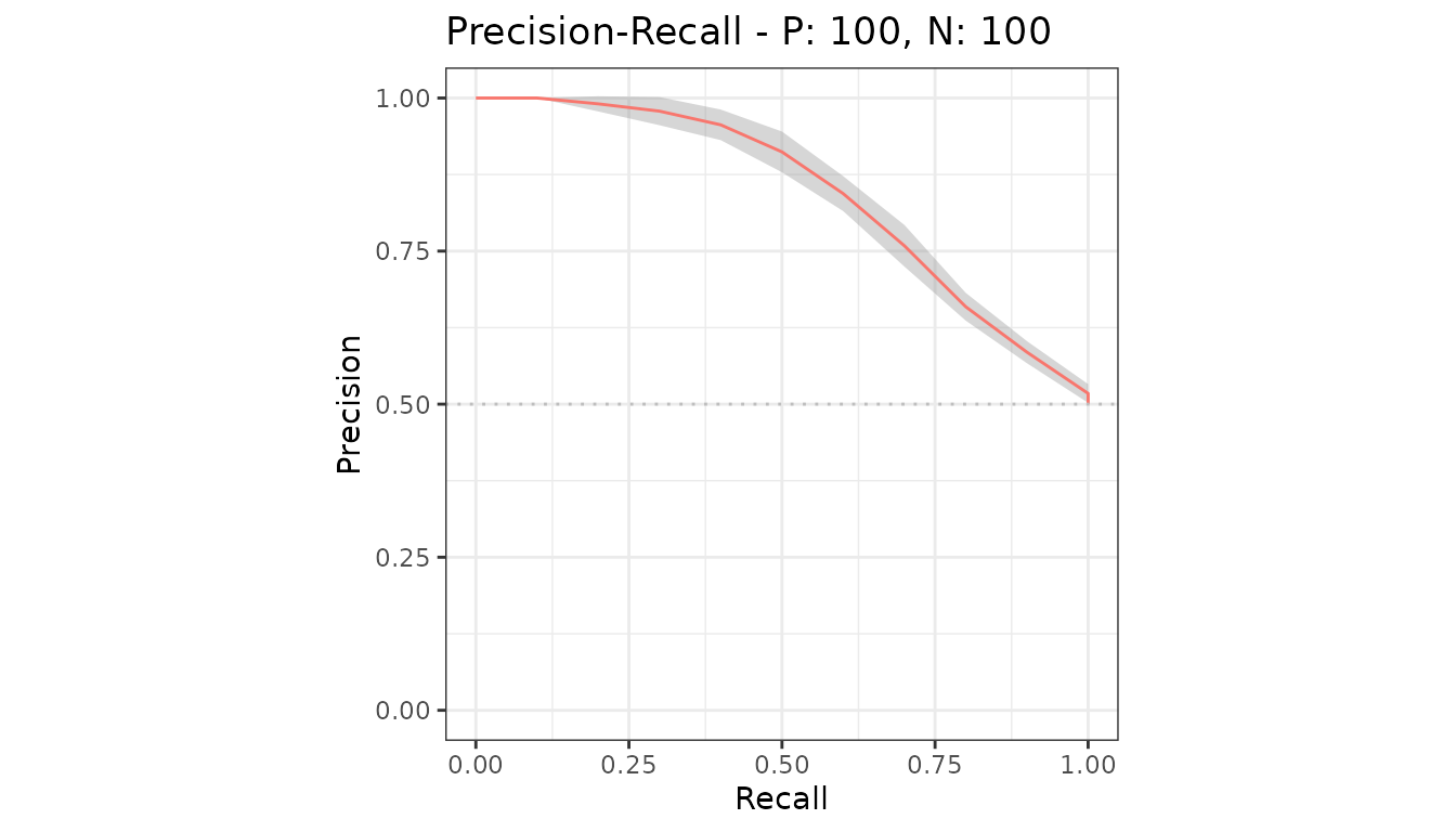
precrec evaluates each curve at a fixed grid of x values
and averages there. x_bins sets how many intervals that
grid has.
With x_bins = 2, the grid is x = 0, 0.5, 1.
With x_bins = 10 it is every tenth.
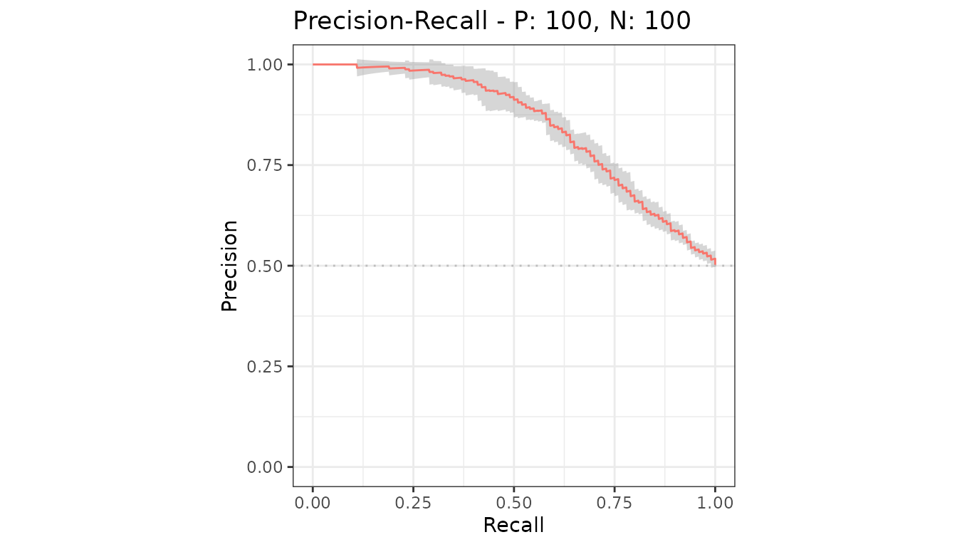
The default is 1000, which is smooth at any normal figure size. Lower it only for very large datasets.
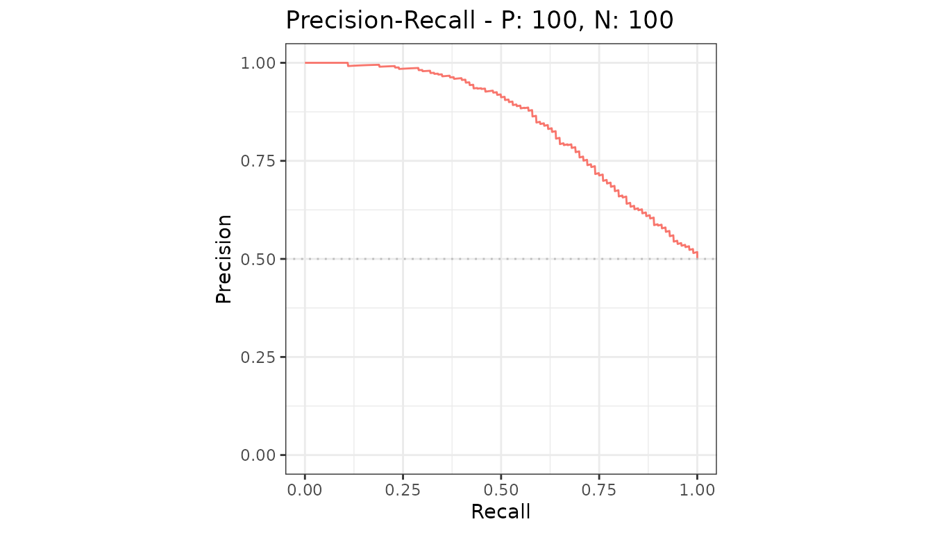
Showing the individual curves instead
Ask evalmod() to keep them, then plot them.
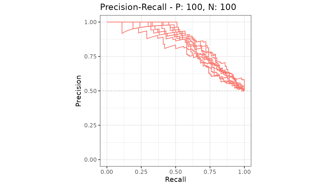
Keeping the raw curves costs memory proportional to the number of test sets, which is why it is not the default.
What the band is and is not
It is a point-wise interval: at each x, an interval for the mean y over the test sets. It is not a simultaneous band for the whole curve, and it says nothing about how the model would do on data from a different source.
For an interval on the area rather than the curve, use
auc_ci(); see AUC and other
curve summaries.