
mode = "basic" plots evaluation measures against the
normalized rank of the scores - that is, against how far down the ranked
list the cutoff sits.
library(precrec)
library(ggplot2)

points <- evalmod(scores = P10N10$scores, labels = P10N10$labels,
  mode = "basic"
)
Pick the panels
Name the measures you want. Each becomes a panel.
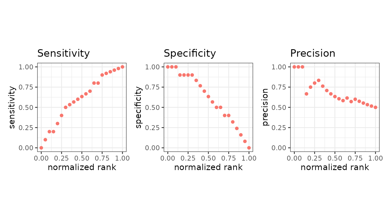
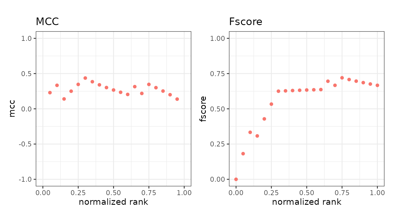
Called with no measures, you get all fourteen default panels at once, which is useful for a first look and too dense for a report.
Reading the x axis
The x axis runs from 0 to 1 and is the fraction of the dataset above the cutoff. At x = 0 nothing is predicted positive; at x = 1 everything is. So the left edge is the strictest cutoff and the right edge the most permissive.
This is what makes the panels comparable across datasets of different sizes.
Scores and labels
Two extra panels show the data behind the measures rather than a measure: the score at each rank, and the observed label.
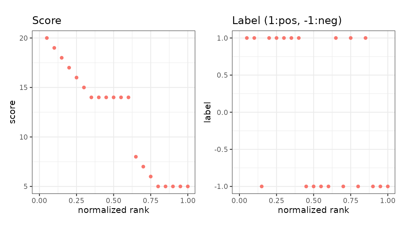
The label panel is the quickest way to see whether the positives really are concentrated at the top of the ranking.
Extra measures
Anything beyond the default fourteen is requested with
metrics = and then plotted the same way.
extra <- evalmod(scores = P10N10$scores, labels = P10N10$labels,
  mode = "basic", metrics = c("fpr", "lift")
)

autoplot(extra, c("fpr", "lift"))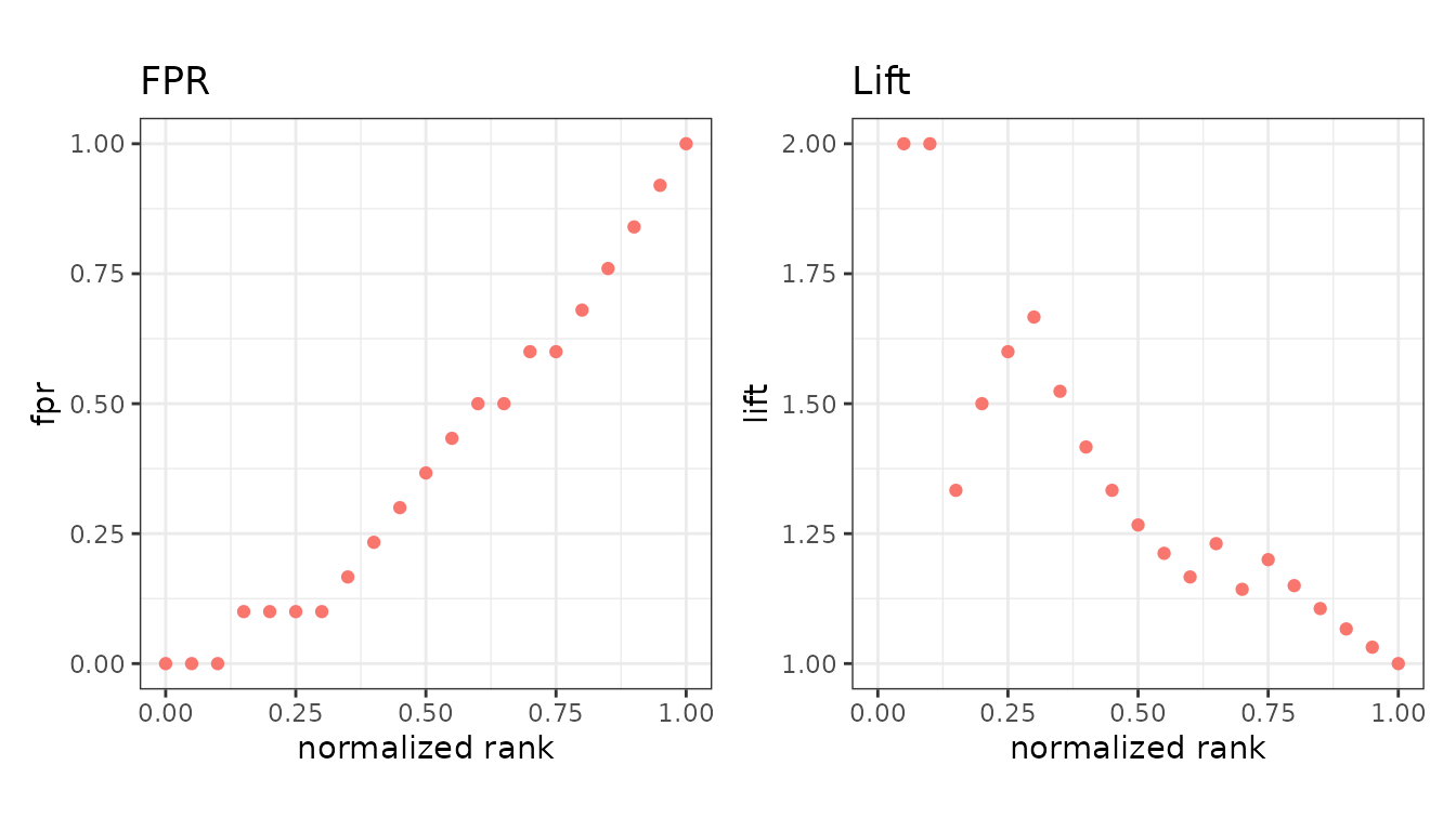
Asking to plot a measure that was not calculated is an error that names the argument to add. See the measures overview.