
These combine several cells of the confusion matrix into one number that does not collapse when the classes are imbalanced. The first six are in the default set; the last two are asked for by name.
library(precrec)
library(ggplot2)

points <- evalmod(scores = P10N10$scores, labels = P10N10$labels,
  mode = "basic"
)
Balanced accuracy and F-score
| Measure | Formula | Range |
|---|---|---|
balanced_accuracy |
(sensitivity + specificity) / 2 | 0 to 1 |
fscore |
harmonic mean of precision and recall | 0 to 1 |
Balanced accuracy is accuracy with both classes weighted equally, so the majority class cannot carry it on its own.
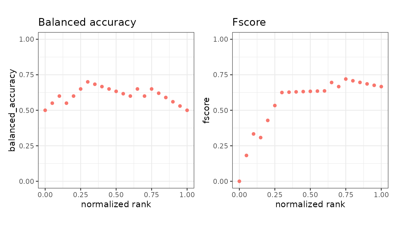
fscore is the F-beta score and defaults to F1.
beta weights recall against precision:
beta = 2 counts recall twice as heavily,
beta = 0.5 half as heavily.
f2 <- evalmod(scores = P10N10$scores, labels = P10N10$labels,
  mode = "basic", beta = 2
)
Correlation-like measures
| Measure | Formula | Range |
|---|---|---|
mcc |
correlation of prediction and truth | -1 to 1 |
kappa |
agreement above chance | -1 to 1 |
Matthews correlation coefficient uses all four cells of the table, so it is high only when the classifier does well on both classes. Cohen’s kappa compares observed agreement against the agreement two raters with these margins would reach by chance.
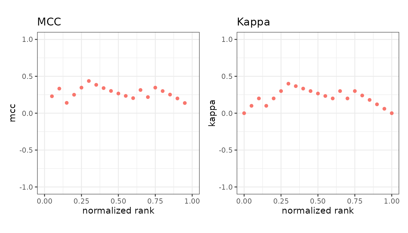
Both can go negative, meaning worse than chance. Their plots are drawn on a -1 to 1 axis for that reason.
Informedness and markedness
| Measure | Formula | Range |
|---|---|---|
informedness |
sensitivity + specificity - 1 | -1 to 1 |
markedness |
precision + NPV - 1 | -1 to 1 |
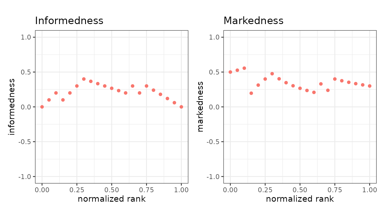
Informedness, also called Youden’s J, is how much better than guessing the classifier is over the actual classes; markedness is the same idea over the predicted classes. Their geometric mean is the MCC.
Skill scores
| Measure | Formula | Range |
|---|---|---|
roc_dist |
distance to the perfect point in ROC space | 0 to sqrt(2) |
sedi |
symmetric extremal dependence index | -1 to 1 |
These two are not in the default set, so name them in
metrics =.
skill <- evalmod(scores = P10N10$scores, labels = P10N10$labels,
  mode = "basic", metrics = c("roc_dist", "sedi")
)

autoplot(skill, c("roc_dist", "sedi"))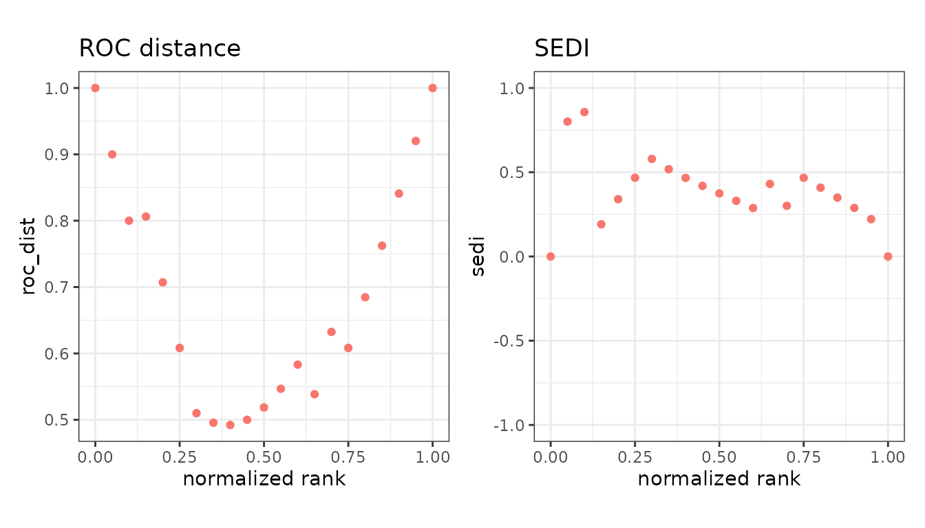
roc_dist is the straight-line distance from the point
(1 - specificity, sensitivity) to the top-left corner of
ROC space, where both are 1. It is the only measure on this page that is
better when it is smaller, and the only one whose
maximum is sqrt(2) rather than 1. Picking the cutoff that
minimizes it is one of the standard ways of choosing an operating point
off a ROC curve.
sedi comes from forecast verification, where the event
being predicted is often rare. It is built so that it does not drift
towards a fixed value as the positive class gets rarer, which is the
failure mode that makes several other skill scores useless for rare
events. It is 0 for a classifier no better than chance and 1 for a
perfect one.
head(subset(as.data.frame(skill), type == "sedi"), 4)
#>        x         y modname dsid type
#> 316 0.00 0.0000000      m1    1 sedi
#> 317 0.05 0.8009110      m1    1 sedi
#> 318 0.10 0.8572931      m1    1 sedi
#> 319 0.15 0.1912334      m1    1 sedi
Both measures are undefined at the two ends of the ranking, where
every prediction is one class: roc_dist is still finite
there, and the four logarithms sedi needs are clamped away
from 0 and 1 so that it is too.
Which to report
For a single number on imbalanced data, mcc is the
safest of these - it has no blind spot in any cell of the table.
fscore ignores the true negatives entirely, which is
usually deliberate but worth knowing. For choosing an operating point
rather than scoring one, roc_dist is the more direct
answer, since minimizing it is the question you are actually asking.
None of them replaces a curve: each still describes one cutoff, and the cutoff is a choice you have to justify. See AUC and other curve summaries.